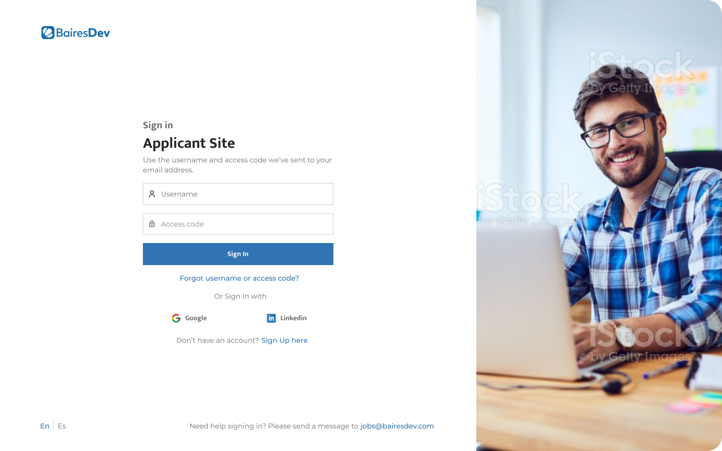
Unifying User Experience: Redesigning a Tech Company's Recruiting Site for Enhanced Conversions Across Devices
In my role as Product Designer, I led a project focused on redefining the user experience of a major tech company's recruiting site. The project aimed to redesign the existing system, introduce new flows, establish a comprehensive design system, and boost monthly user conversions. Notably, the challenge involved ensuring a harmonious user journey across both desktop and mobile platforms, with a pragmatic emphasis on accommodating varied user preferences.
Cross-Platform Consistency
Emphasizing a unified user experience, the redesign sought to maintain consistency across desktop and mobile platforms. While recognizing the prevalence of mobile usage, the goal was to create an adaptable design that catered to the strengths of each platform without overly prioritizing mobile.
Adaptive Design Principles
Employing adaptive design principles, the project ensured that the user interface seamlessly adjusted to different screen sizes and resolutions. This approach aimed to provide users with an intuitive and visually pleasing experience, regardless of whether they accessed the recruiting site from a desktop computer or a mobile device.
Optimizing Mobile User Experience
Recognizing the prevalence of mobile users, special attention was given to refining the mobile experience. User flows were reimagined to account for the constraints and advantages of smaller screens, creating an experience that was not only efficient but also tailored to the unique interactions associated with mobile devices.
Strategic Desktop Refinements
Acknowledging the importance of the desktop experience, the redesign included strategic refinements tailored to larger screens. User flows were optimized to enhance efficiency, creating a more engaging environment for users accessing the site from desktop computers.
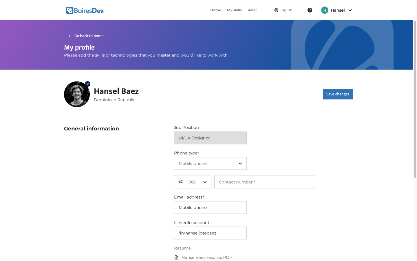
User-Centric Navigation
The project prioritized user-centric navigation that accommodated the distinct characteristics of both desktop and mobile interactions. This approach aimed to provide an efficient and satisfying experience for users across devices, with due consideration to the unique demands of each platform.
The redesigned recruiting site successfully balanced the user experience across desktop and mobile platforms. By adopting adaptive design principles and strategically refining both interfaces, the project achieved a harmonious user journey. The result was an improved overall user experience and a notable increase in monthly user conversions, demonstrating the project's success in catering to diverse user preferences without overly emphasizing mobile interactions.